LinkedIn recently launched a new feature called InMaps. With the new feature you can visualize your connections to see how they are connected to each other, where the hubs are and how your connections are related. All of this helps you better understand your relationship with your professional network. You might be surprised how some of your connections know each other. You can see my InMap below.
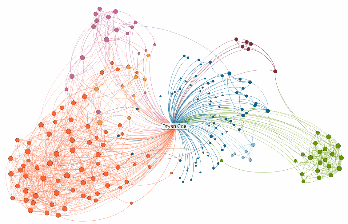
Your connections are be grouped together by the way you know each connection. This could be an employer, previous employer or a university where you studied. Each connection is represented with a circle. Larger circles and names represent the most connected members. As you look over your network you’ll be able to determine where the most influential hubs and people are. This gives insight into who to contact when you are looking for a job, looking to hire, help out a friend and much more.
Check out the video below for a quick demo.